

")
 Article
 Infographic
 Plugin Development
 WordPress Development
 WooCommerce Development


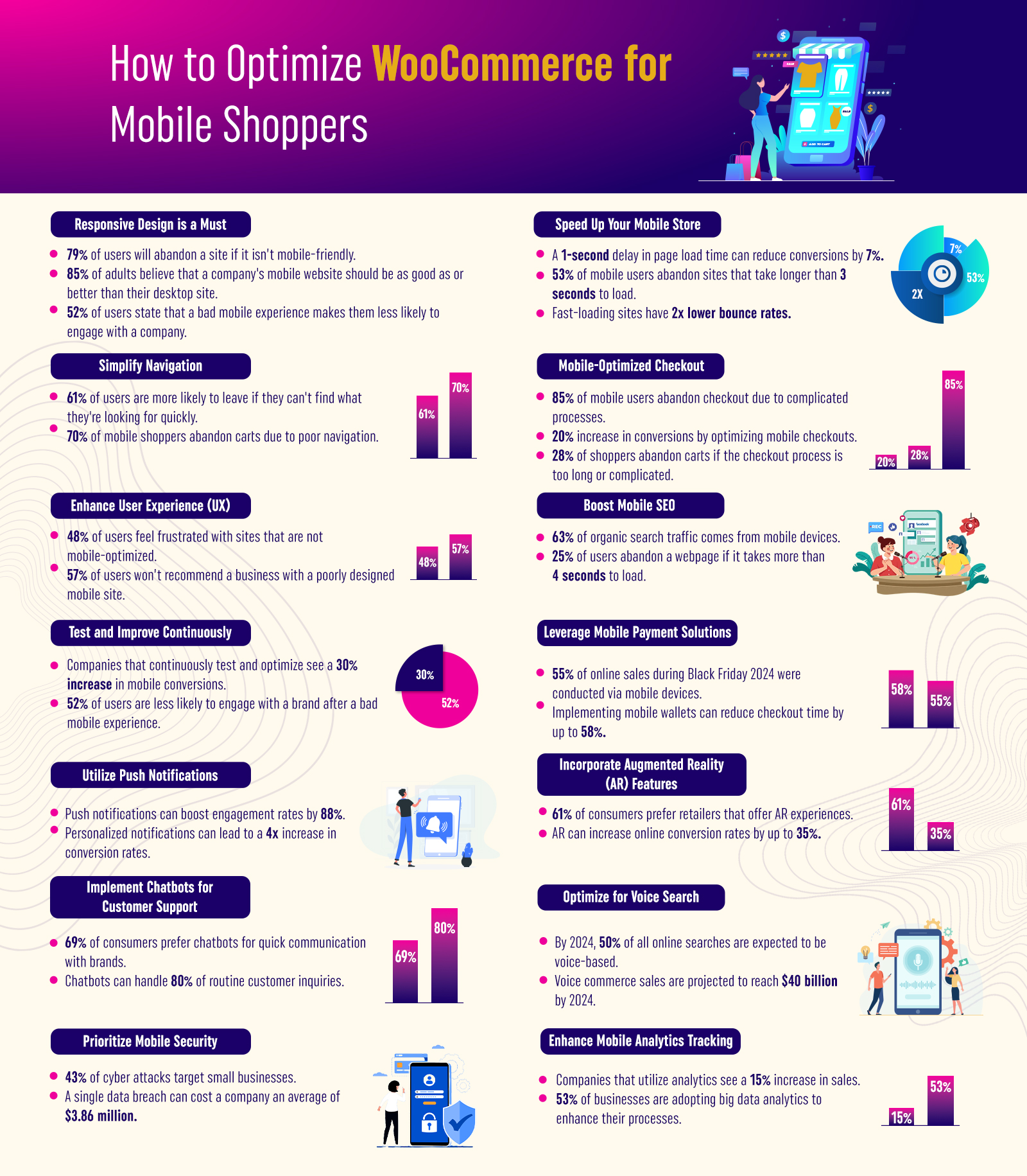
Mobile shopping has become ubiquitous — especially for WooCommerce stores aiming to capture the ever-growing segment of mobile shoppers.
Statistics show that 79% of users will abandon a site if it isn’t mobile-friendly, and 85% of adults expect their WooCommerce mobile shopping experience to match or exceed desktop performance. Optimizing your online store for mobile is critical.
This infographic delves into comprehensive strategies designed to enhance the mobile shopping experience.
From ensuring a responsive design and speeding up load times to simplifying navigation, optimizing the checkout process, and even leveraging advanced technologies like augmented reality and chatbots, each section is backed by compelling statistics and actionable tips.
Conclusion
Optimizing WooCommerce mobile shopping is an ongoing process that requires continuous attention and adaptation to evolving consumer behaviors and technological advancements.
You can overcome common obstacles such as high cart abandonment rates and poor user engagement by embracing responsive design, ensuring fast page load times, simplifying navigation, and refining the checkout experience.
Additionally, incorporating modern solutions like mobile payment options, push notifications, augmented reality, voice search, and chatbots can further differentiate your store in a competitive marketplace.
The statistics presented — ranging from the impact of a 1-second delay reducing conversions by 7% to mobile wallets cutting checkout times by 58% — underscore the tangible benefits of a mobile-optimized approach.
As mobile commerce continues to surge, the insights and strategies in this infographic serve as a valuable guide to not only meet but exceed your customers’ expectations.